
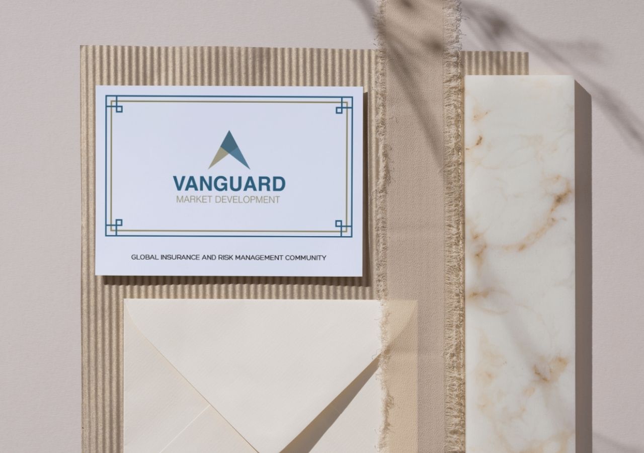
VANGUARD MARKET DEVELOPMENT
Global Insurance and Risk Management Community
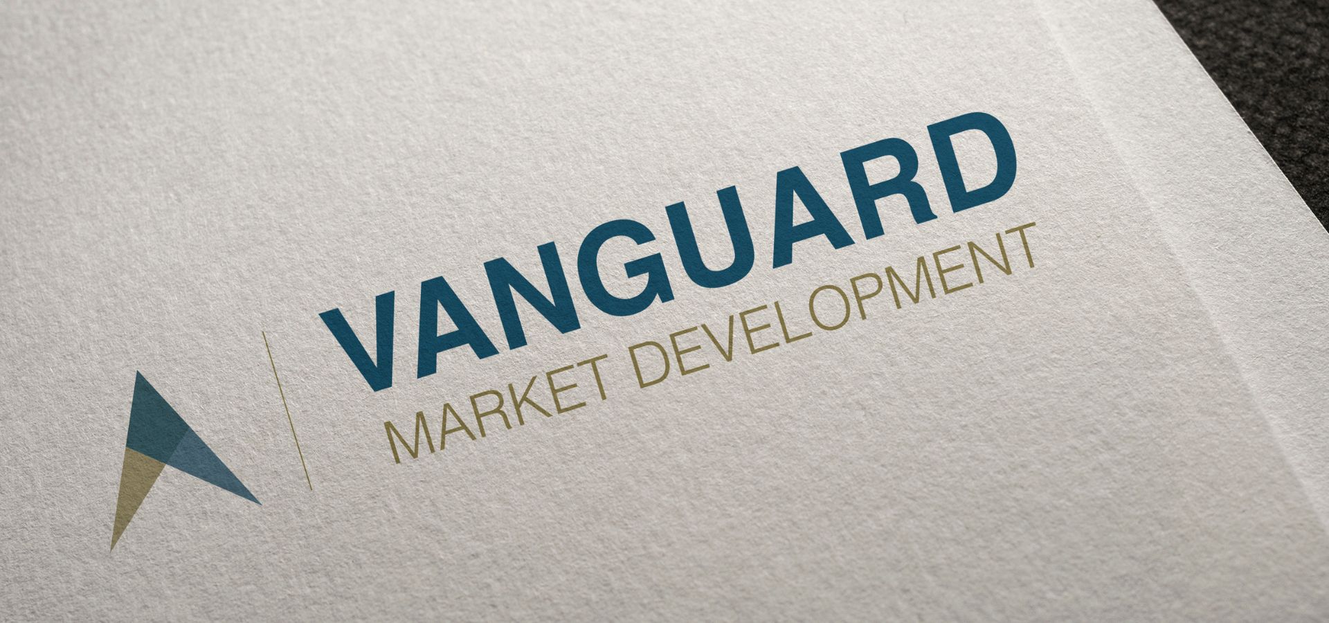
The Vanguard Market Development logo was created for the International Insurance Society’s (IIS) newly established award recognizing leadership in innovation and emerging ideas. In designing the logo, I began by exploring the meaning of the word “vanguard,” identifying key themes such as leadership, innovation, and progress. Collaborating closely with the client, we chose upward arrows to represent forward movement and new developments. To maintain brand consistency, I worked within the IIS color palette, selecting blue and gold – colors that convey trust, confidence, courage, and passion, all qualities reflective of the award’s purpose.

CHAMPIONSHIP RUN REAL ESTATE SOLUTION
Real Estate Company
The logo for Championship Run Real Estate Solutions combines modern design with a strong urban identity to reflect professionalism and trust. It features a clean skyline silhouette with varying building shapes and window patterns. These graphic elements symbolize diverse real estate offerings. The bold dark blue font used for the company name conveys strength, while the green tagline and skyline outline suggest growth and reliability. The layout maintains a clear hierarchy, with the company name as the focal point, supported by a sleek tagline below.
BEAUTY IN AGAPE
Hand-Made Jewelry
The logo for Beauty in Agape reflects a handmade jewelry brand rooted in elegance, love, and craftsmanship. Featuring a circular design with a soft purple background and white text, the logo uses a flowing script font for the word “bia” to convey grace and artisanal quality. The outer ring includes the phrases “beauty in agape” and “handmade jewelry,” reinforcing the brand’s values of love and authenticity. The overall layout is clean, balanced, and feminine, making it ideal for a boutique setting, it effectively communicates a warm, artistic, and welcoming brand identity.